Why Black & White? Reason One
Last week I created my first photographic “training” presentation. It was a discussion about black and white photography presented to my camera club. The session included a handful of reasons why black and white made sense and the occasions that accompanied them followed by a few thoughts on how to create black and white images in camera and within Lightroom. The presentation seemed well received and I thought I would discuss some of the why’s and when’s here.
The first why was that color can often be a distraction. Color has a tremendous power to catch the eye’s attention and pull it away from the elements of composition. Leading lines are disrupted, subjects are shouted out and final visual resting points are removed from the photographer’s intent. The easiect way to tone down a noisy image is to turn the color off. The photographer can use the tools of his skill to draw their audience to the lines and items they wish to feature and express.
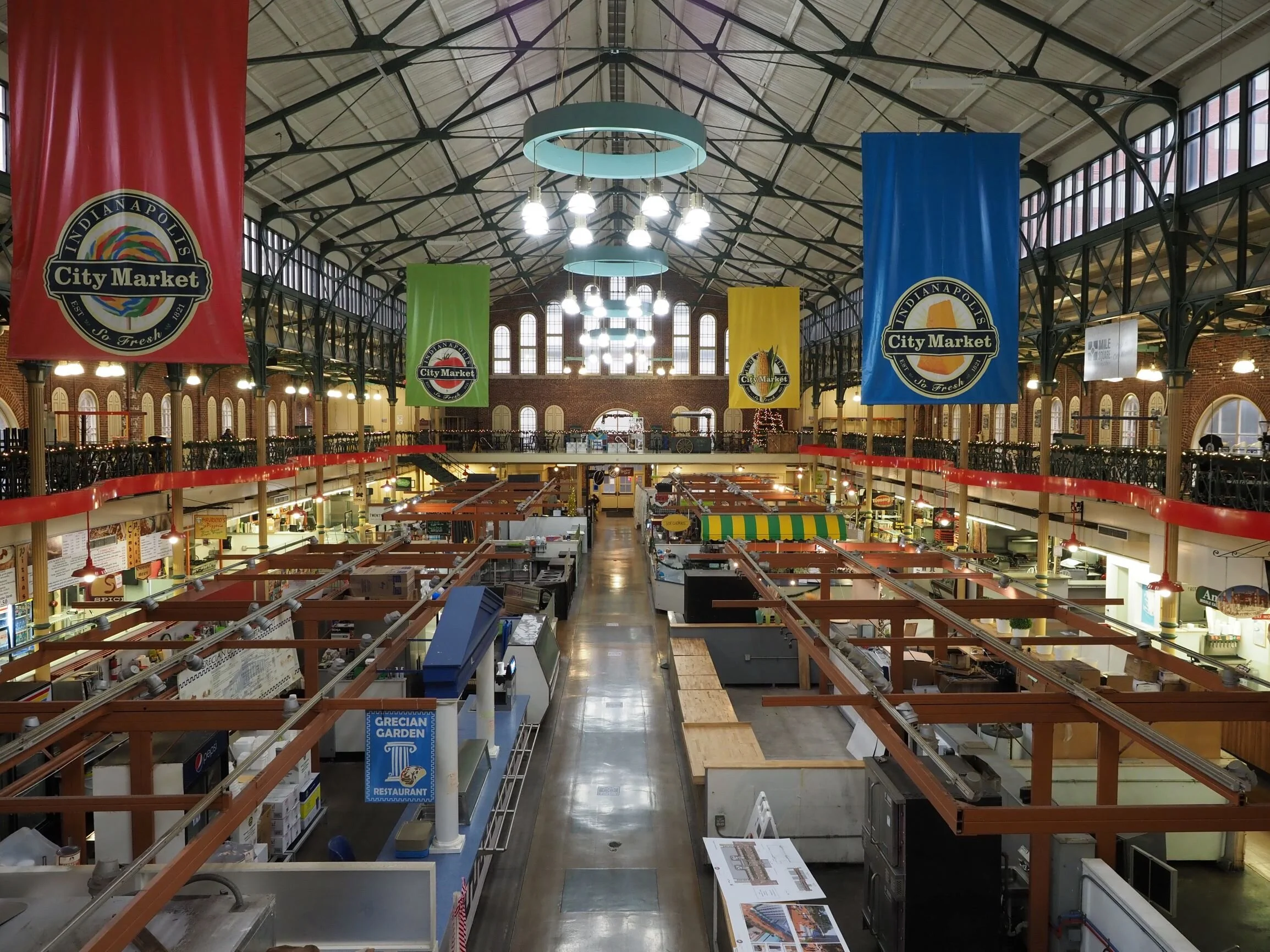
The image above I had intended to treat as black and white before I had even arrived at the location. Once there, it was a good thing that I had planned to do so. Indianapolis City market is a structure that has been a feature of the east side of downtown for over 130 years. I anticipated that this historic structure would render well in monochrome. When I arrived I noticed four very large banners hanging from the rafters, each a different bold color. As I composed and made the image, the banners dominated the viewfinder. My goal was to focus on the leading lines of the roof rafters, balcony and stall dividers creating a tunnel affect leading the eye to the historic brick facade in the rear of the building. But instead, my eye bounced from banner to banner examining the color of each. The color had to go.
Much of the time when I am making images I know if I will be presenting the final photograph in black and white at the time when I have the camera in hand. But not always. As I process images a question I ask myself is whether color is the first or second most important element of the image. If not, then I de-saturate and consider possibilities from there. Sometimes I return to color, sometimes continue to work in monochrome.
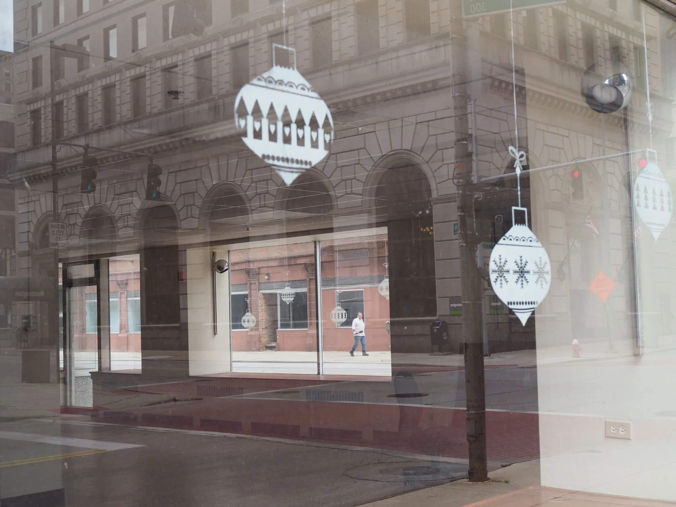
The image above is one such example. The two key elements of the image is layering of reflections that wind up framing the subject, a lone man walking down an empty Toledo street during the early months of the pandemic. Color does nothing here, so I chose to remove it and instead worked on the tones so they accentuated the reflections and framing.
There’s no need to turn your back on color as a photographer, but sometimes it is best to save it for when you plan for it to jump off the print and make the scene, not steal it.


